Hello Wembley!
Hello Wembley!
5.5.21
Where on earth do you start with this one? “Don’t write War And Peace,” they said…..
How? How do you not write a tome on this one, there’s just so much to talk about?! This really is a ‘feast for the eyes’…..
This was a project for Peabody at their Williamson Heights development in Wembley and whilst we’ve worked with them loads before, this was the first chance to work on a large residential amenity space for them.
And they were most definitely as open-minded, brave and ‘up for it’ as they always are!!
SPACE PLANNING
Quite often the floorplan’s already pretty much fixed once a client brings an interior designer on board.
So, whilst we may be able to design what goes in the space and sometimes decide what certain areas are used for, we may not be able to affect the overall general layout.
This wasn’t one of those occasions.
This was one of those fab occasions where the client came to us, blank sheet of paper in hand and said, ‘go do your thing’!
‘Our thing’ starts with the concept, but part one of the concept is research – a LOT of research.
We do it on all our jobs, it’s something we pride ourselves on.
You can’t design a scheme that’s going to work perfectly for a development and its target audience unless you know who they are and what the area has to offer.
There’s no point designing the most incredible gym if there are two fab gyms already on the doorstep.
There’s no point designing some awesome, huge, tiered cinema if there’s a mammoth multi-plex within stumbling distance – you get the picture…..
We thoroughly researched the wider area, what was on offer on the doorstep, what competitors were doing, who the likely residents were etc…
Pretty soon a picture started to form. There is so much to do on the doorstep - you’re spoilt for choice for leisure, retail, eating, drinking and sports.
So why try and just recreate all that on site?
A CONCEPT STARTS TO FORM
Ideas were starting to form – lots of them. We’d need a lot of space to get all these in though.
Well, as luck would have it, this space is a behemoth.
A first glance at the plans showed an enormous space, running along the front of the development with a bank of floor-to-ceiling windows.
But then a glance to the other side and you realise we’ve got almost the same again – talk about spoiling us!
We’d ruled out trying to create a fancy gym or mega-screen cinema, residents are spoilt for choice on that front given what’s on the doorstep in Wembley.
This was all about stuff you’d actually want to use, day in, day out. Functions that could actually be useful and have a real positive impact on your daily life.
Your own space to work and to play that was a proper extension to your home.
We played around with the space planning a lot to ensure the space was working as hard as it could. And we reckon we did just that!
We’ve got co-working spaces, private working spaces, a semi-private meeting area, a private meeting room, lounging space, practically-horizontal lounging space,
‘gazing out the window whilst pretending to work’ spaces, meeting with friends spaces, a foosball space, hosting a movie night space,
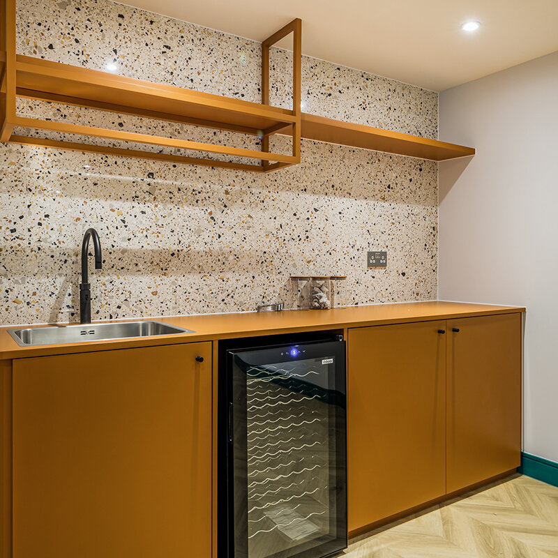
a private yoga or pilates space and a couple of spaces to sort yourself a bevvie whilst you’re doing one or all of the above.
There are probably loads of other things some of the spaces could be used for, but that seems a good enough starter for ten.
We were also provided with the draft marketing collateral when we got the brief. It was bright, it was youthful, it was loud! That totally tied in with the target audience and the local area, so why fight it!?
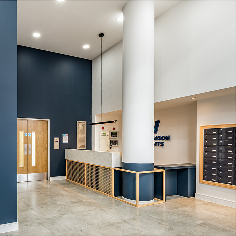
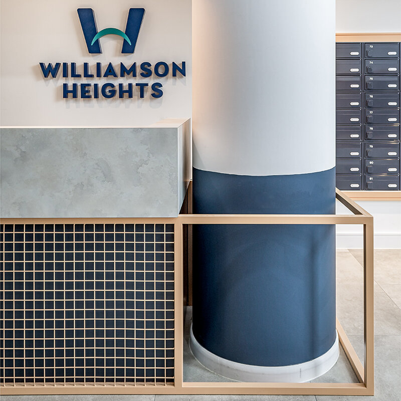
There’s also the small matter of the main concierge. Now normally we’d tell you a lot about that, we’d definitely take the time to wax lyrical about the lovely bespoke desk and the way the column has been cleverly accentuated, so we’ve included a couple of images, but hey, the star of the show is main amenity space upstairs.
TAKE THE TOUR
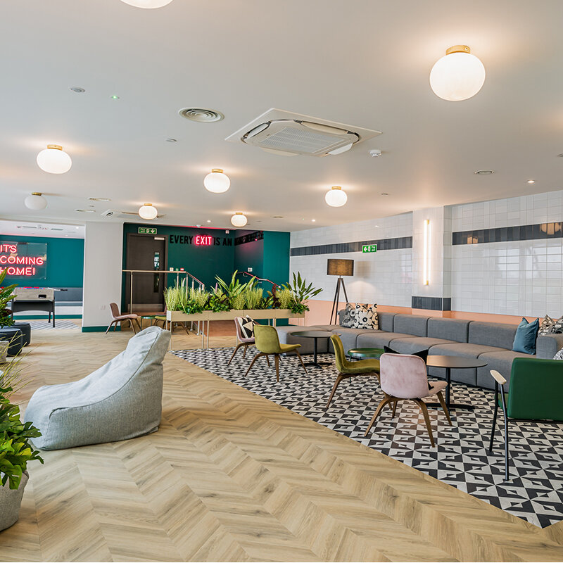
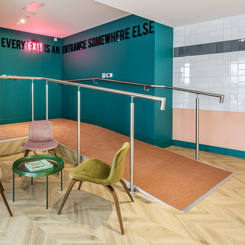
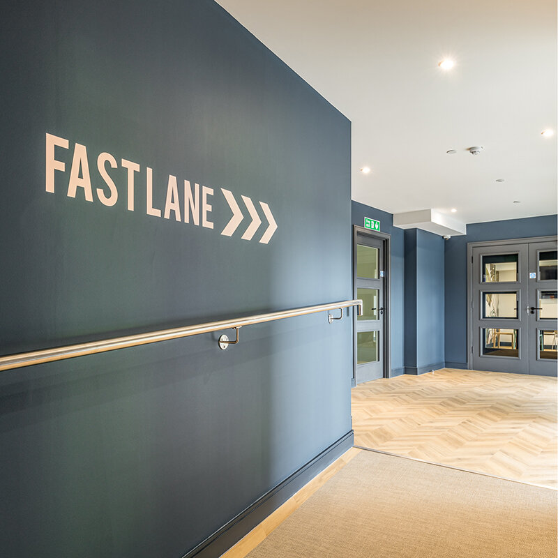
First choice when entering the space is to go left or right. Very different functions on either side. Let’s go right, down the ramp and into the main space……
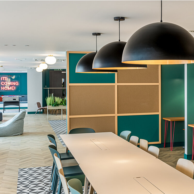
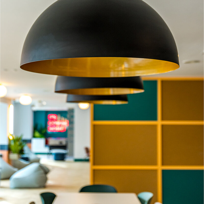
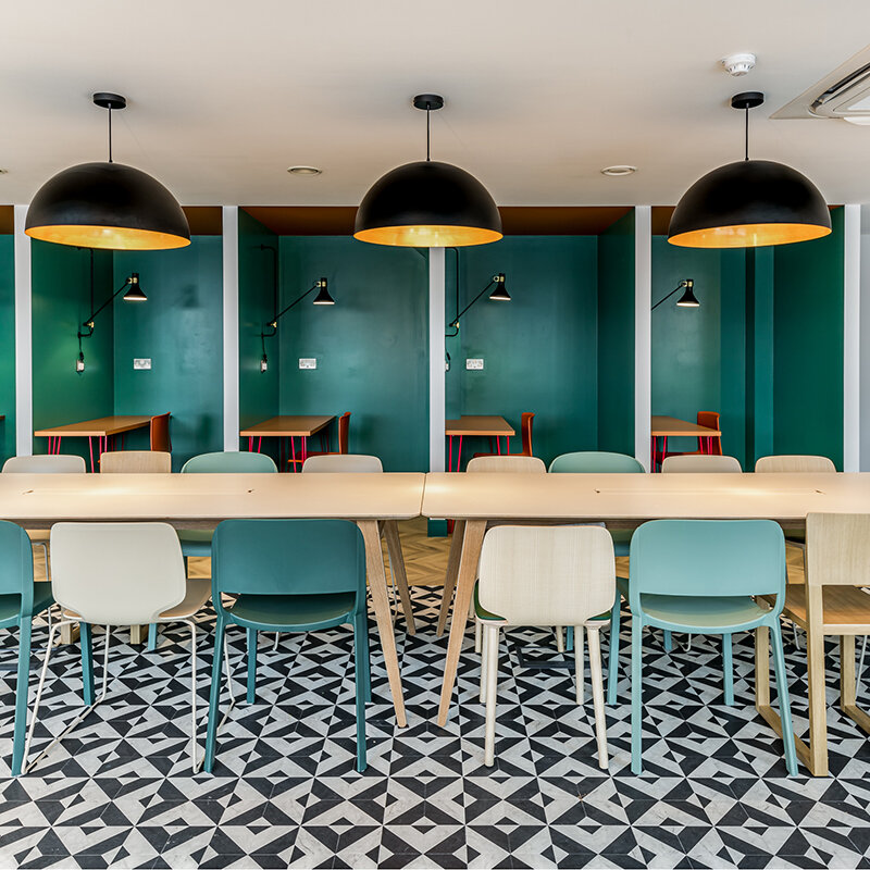
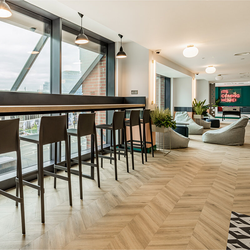
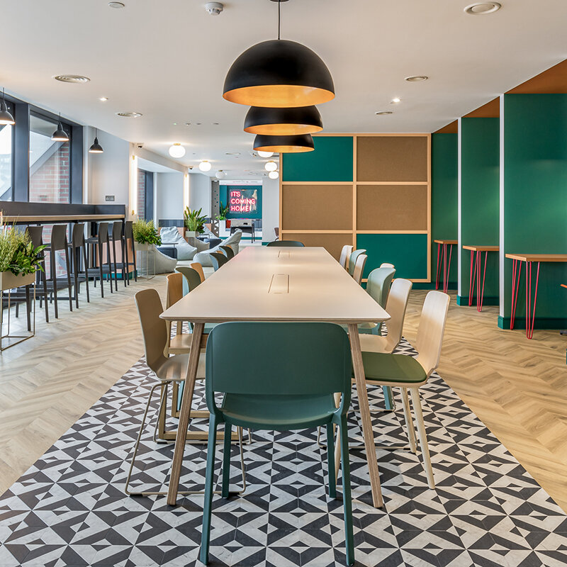
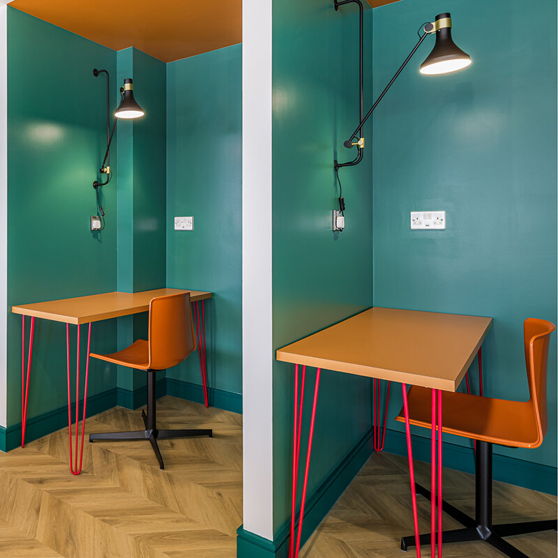
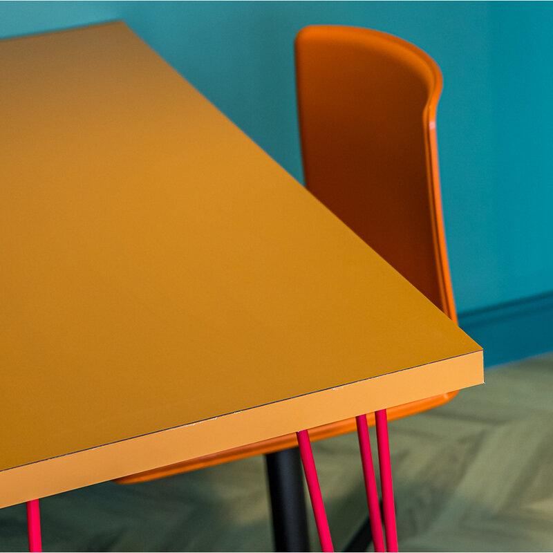
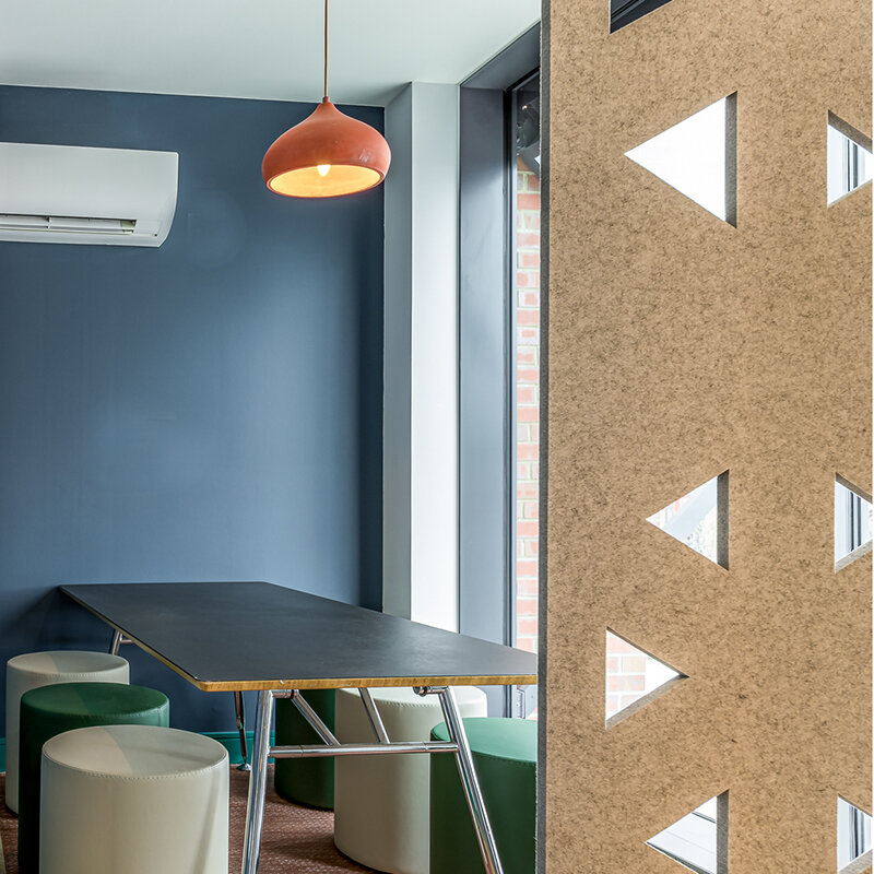
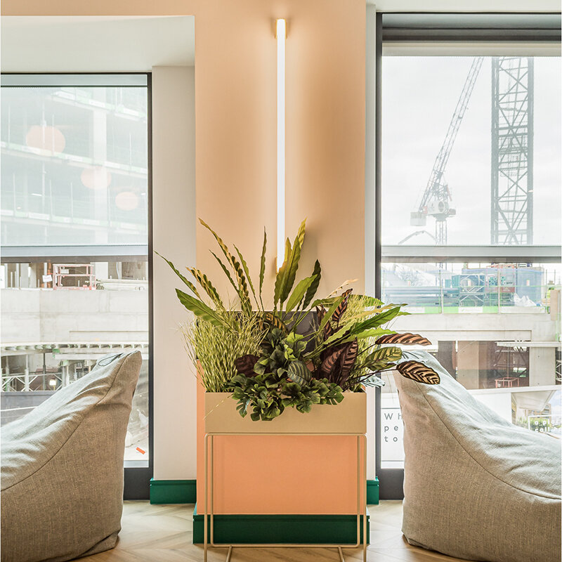
Stretching out in front of you with a bank of huge windows to one side is the main work zone. A massive table sits in the centre, zoned perfectly by rather fab patterning in the flooring. Need to concentrate a bit more? Grab one of the more private booths on the right and set yourself up for the day instead of spending your WFH day listening to your washing machine spin cycle or coming to the rapid realisation that your other half is a completely different person at work to the one you thought you knew! Need to host a small, informal work conflab, then bag yourself the little nook in the corner and pull the screen across. A kitchen and loo mean you can stay down here all day if you want.
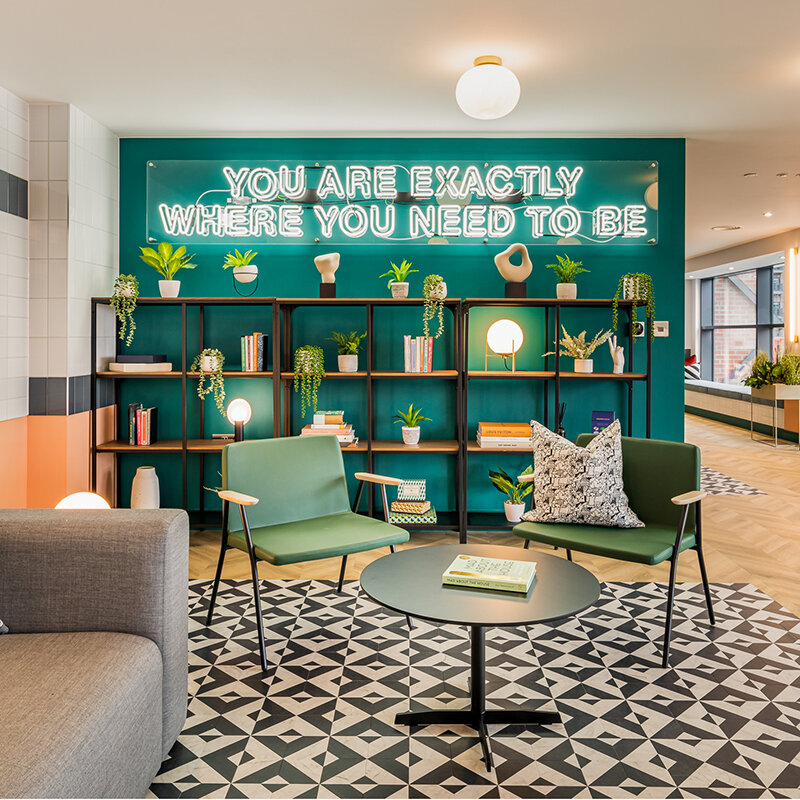
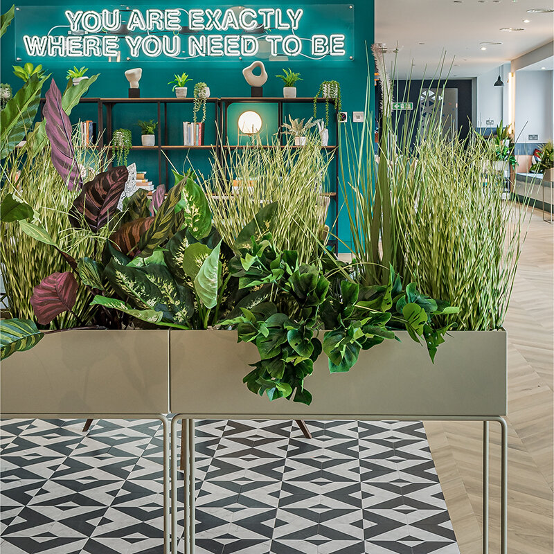
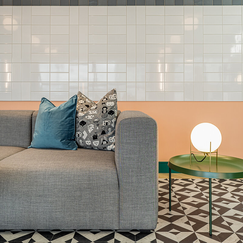
Move through the space and it starts to get more informal with multiple types of seating areas for some solo lounging, or bigger gatherings.
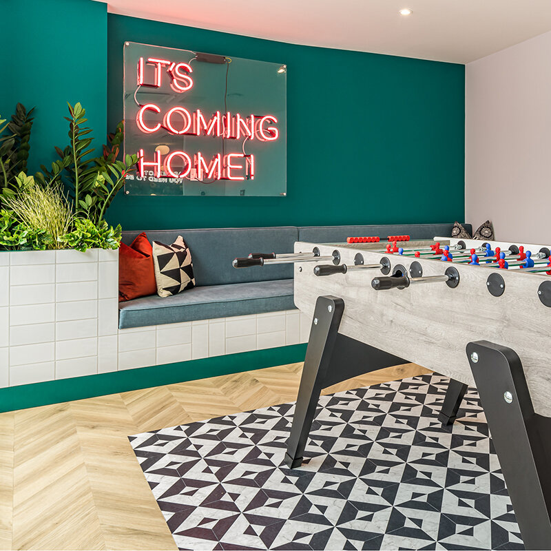
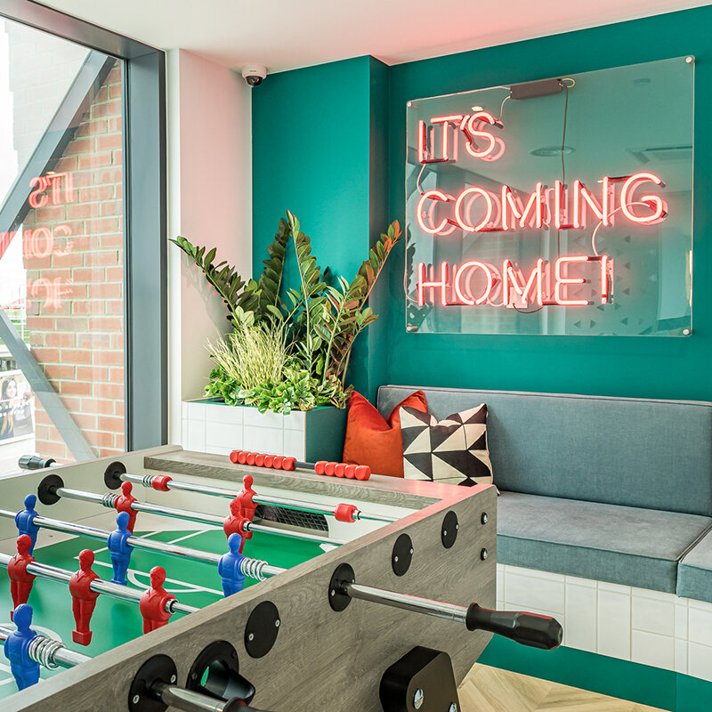
The very far end houses a compact, but bijoux games area complete with foosball table, built in seating, a screen for a bit of privacy and one of the many injections of neon lighting.
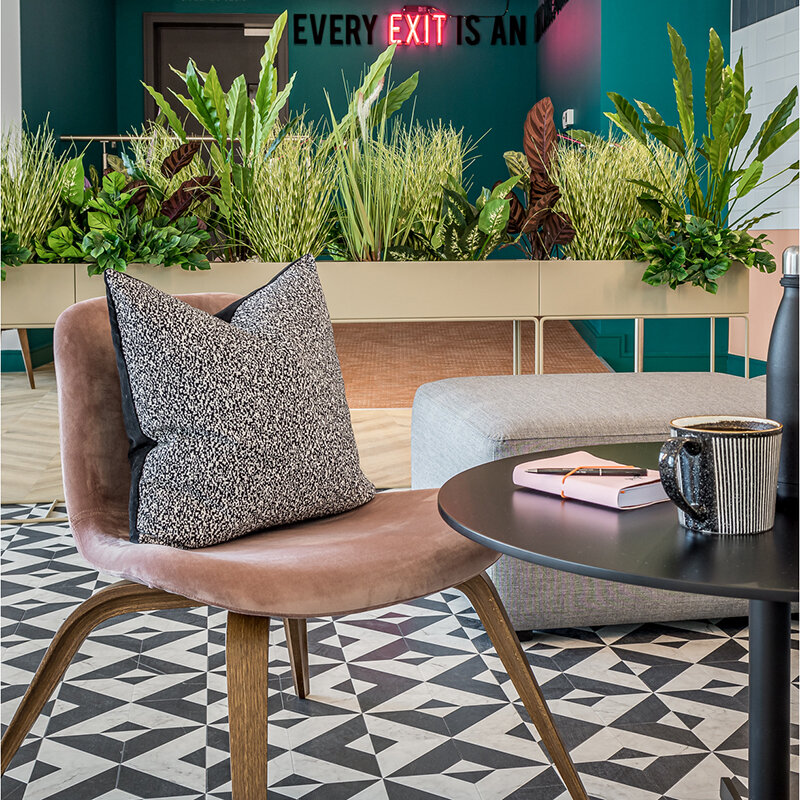
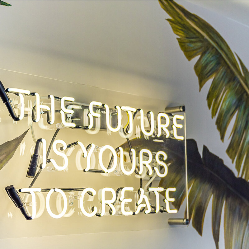
The message shouldn’t really need much explanation given where the development is! Even the Fire Exit sign is fun! Yeah, bet you’ve not read that collection of words together before have you!?
But why shouldn’t it be fun? What could have been a really dull back corner, has been given a cool (but very cost effective) shot of personality.
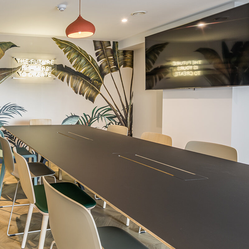
Back to the start and a left turn this time. Here we have a proper meeting room. And by ‘proper’ we mean big TV, big table, lockable door, facilities outside.
This is like your board room at work, only waaay cooler and without the commute. WFH is really not gonna be much of a hardship for Peabody’s residents.
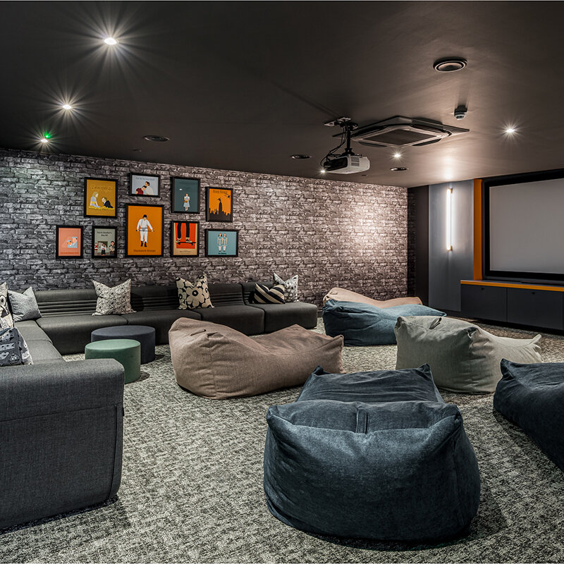
Around the corner we then get the screening room. We know we said there were loads of cinemas in the area and we weren’t gonna do one – that wasn’t a lie, honest!
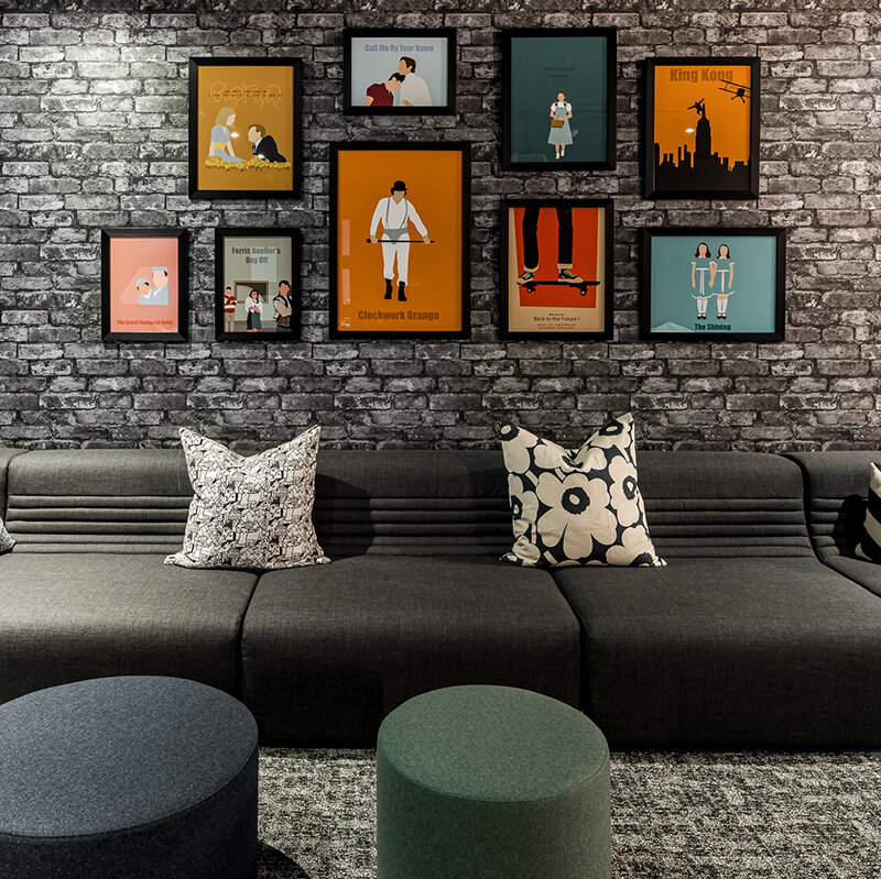
This isn’t supposed to be a cinema. It’s not got banks of uncomfortable tiered seating, this is about a big ol’ room, with a bl**dy big screen and a tonne of comfy seating, so you can book it for the evening, get a load of mates round and watch whatever takes your fancy.
I’m voting Eurovision party, but guess it could also work for some of those sport things that seem to be quite popular!!
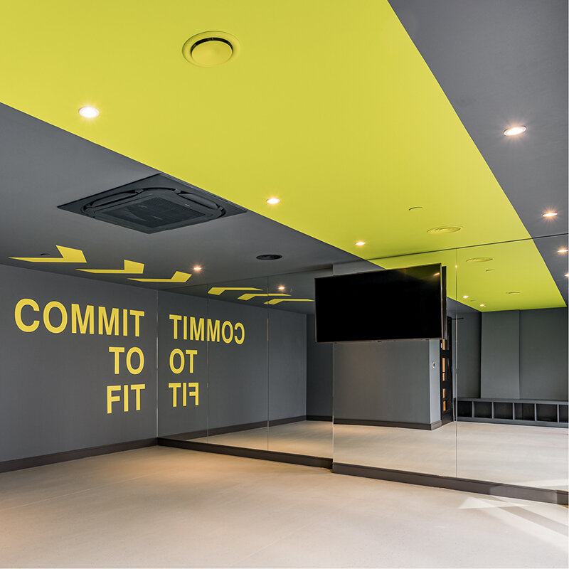
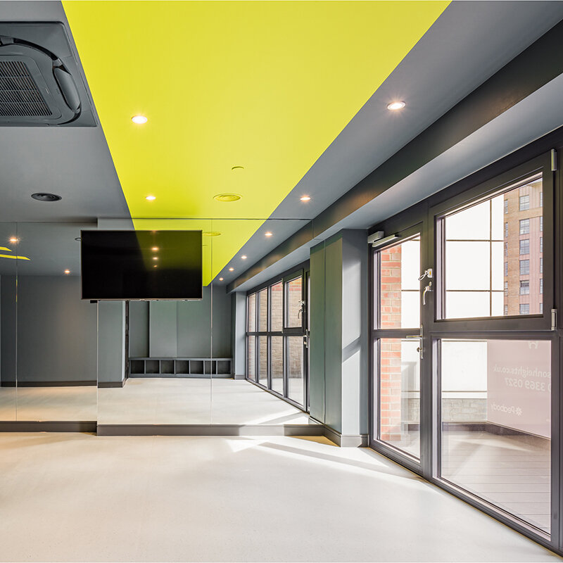
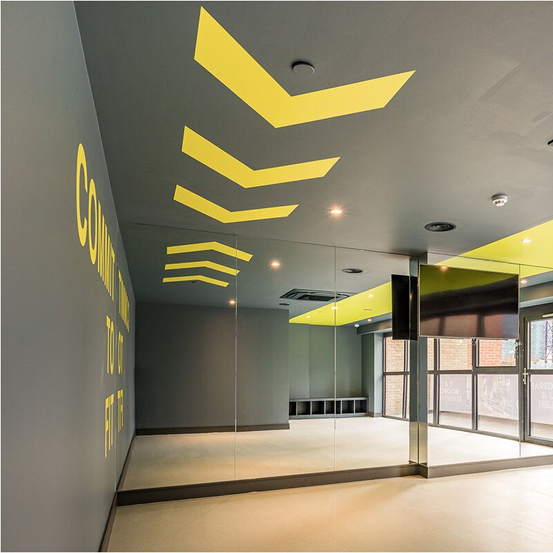
And finally, as if all of that wasn’t enough, we have the studio space. And no, we’re not going back on our word here either, this isn’t trying to compete with the gyms in the area.
This is about having a dedicated space at home, where you can get a few people together and have your own yoga lesson, or club together with a few residents and get a pilates instructor in – all within the comfort of your own development.
We’re over the moon with the way this one’s turned out. We say it a lot, but again, there’s zero style over substance.
Everything works, there’s more flexibility than you can shake a stick at, it’s robust, it’s practical, it’s dynamic, it’s fun, it didn’t cost a small fortune and it’ll be a flippin’ awesome space to have underneath your home!
Words by Steven Pepper
Photography by Franklin+Franklin
To subscribe to our Journal and receive notification of new posts please go to SUBSCRIBE and select JOURNAL, thank you!


