'The Living Rooms'
‘The Living Rooms’
13.8.21
Over the past year Suna Interior Design has partnered with London property developers, Mount Anvil to redesign their head office and to bring their unique ‘Living Rooms’ to life.
‘the living rooms’ : a marketing suite concept
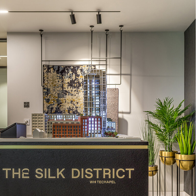
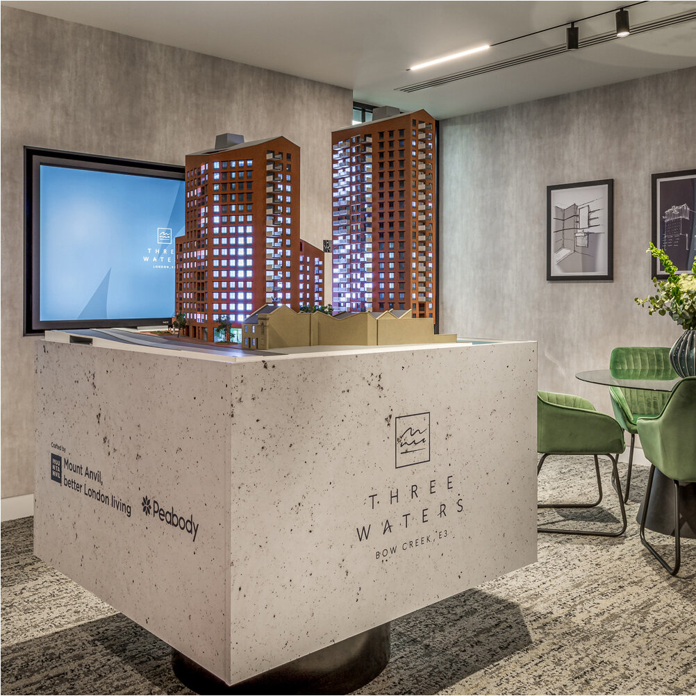
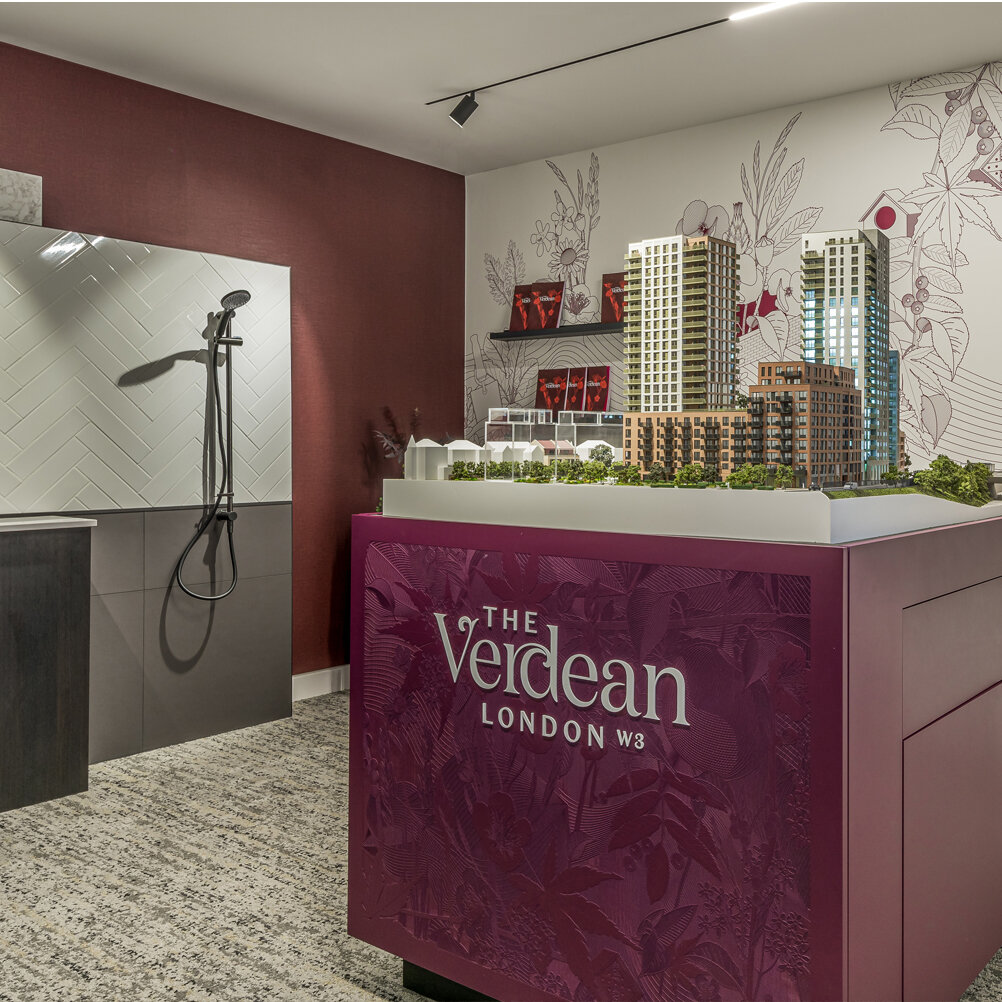
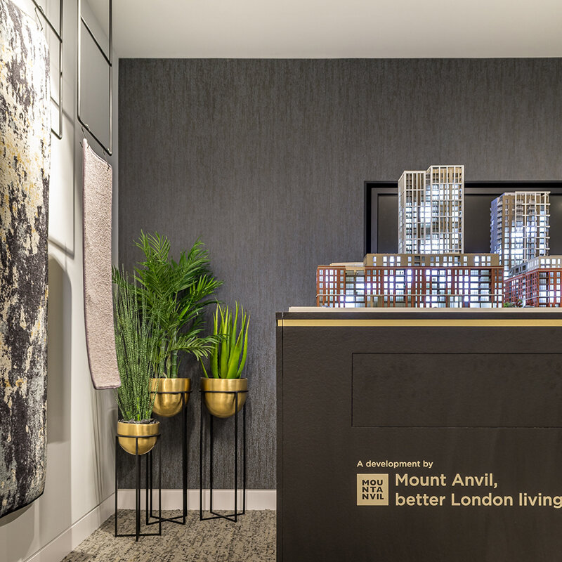
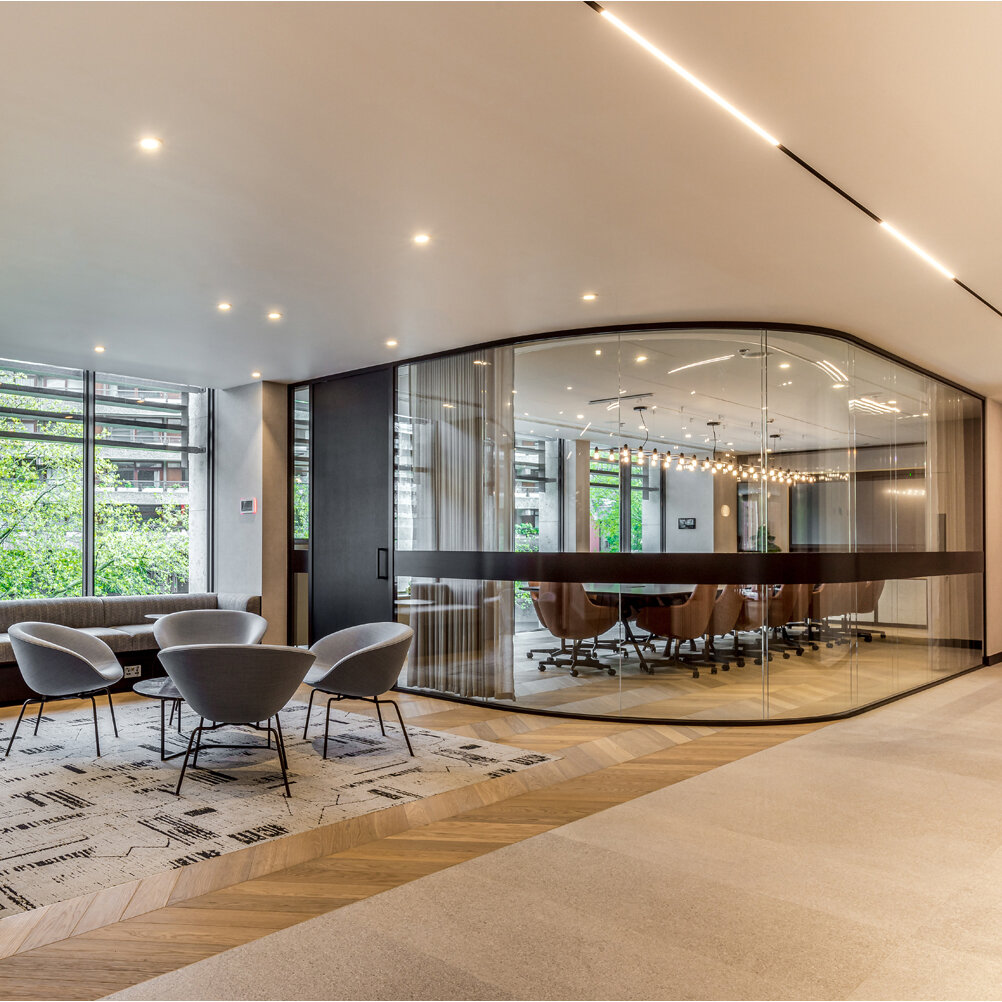
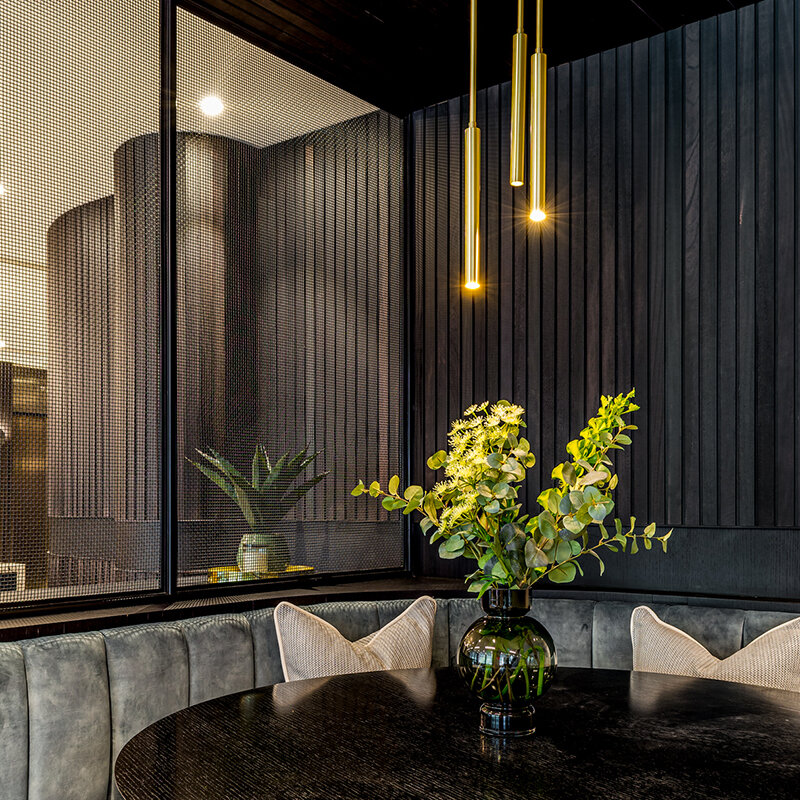
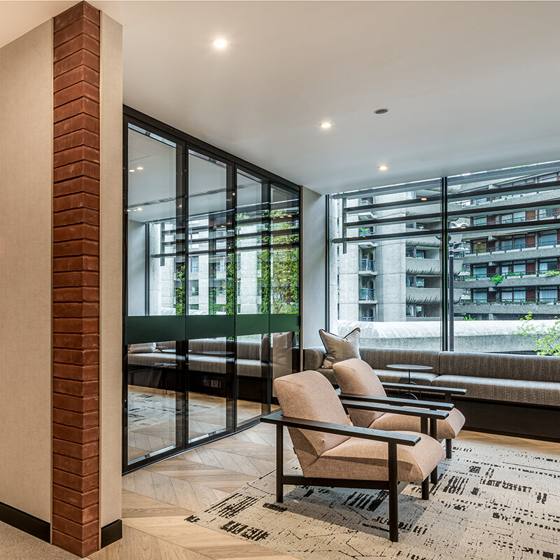
Pushing the boundaries of marketing suite design and flexing industry norms, Mount Anvil’s sales and marketing spaces are now situated at their head office, in Barbican. The 2,000sq ft. space at the heart of their open plan office, has been designed with an exhibition style agenda, to represent Mount Anvil’s brand values – ‘lasting quality and genuine customer care’. Carefully considered space planning has enabled Suna to achieve a subtle but important blend between the sales area and the everyday workings of Mount Anvil’s busy office. Agents, purchasers and employees alike, are invited and encouraged to make use of the multi-functional environment, where the customer experience is at the centre of the design. The art gallery aesthetic, which Suna has created, comprises five sales suites which flow seamlessly from one to the next via glazed sliding doors and curved walkways, enhancing the feeling of openness and transparency.
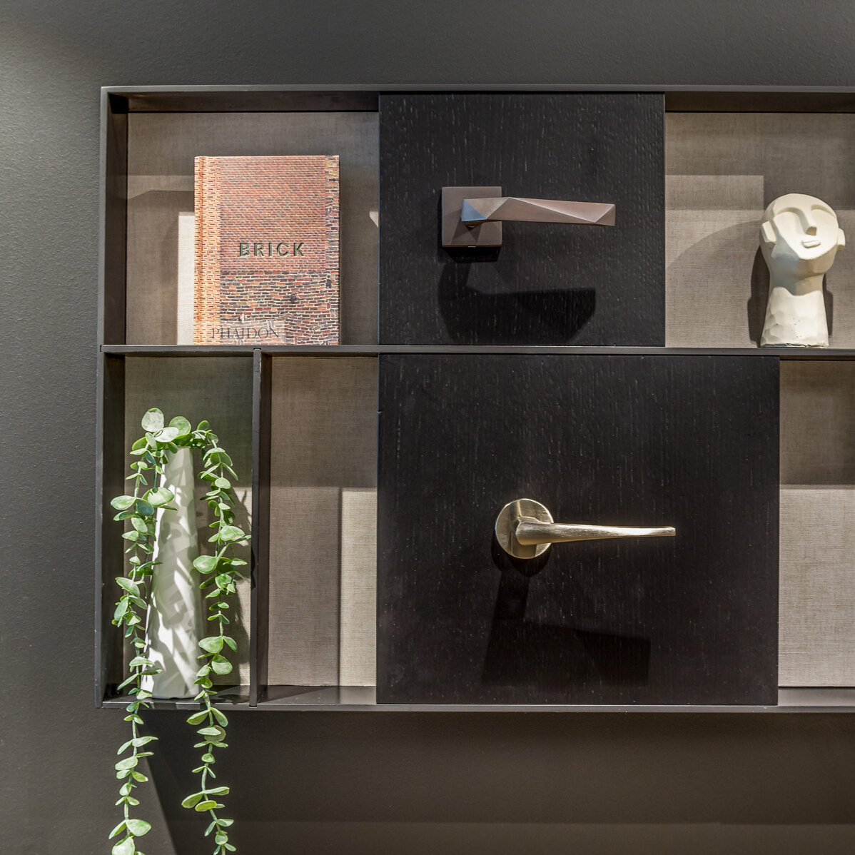
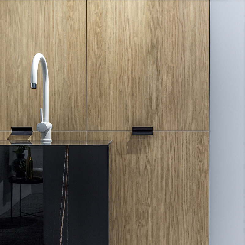
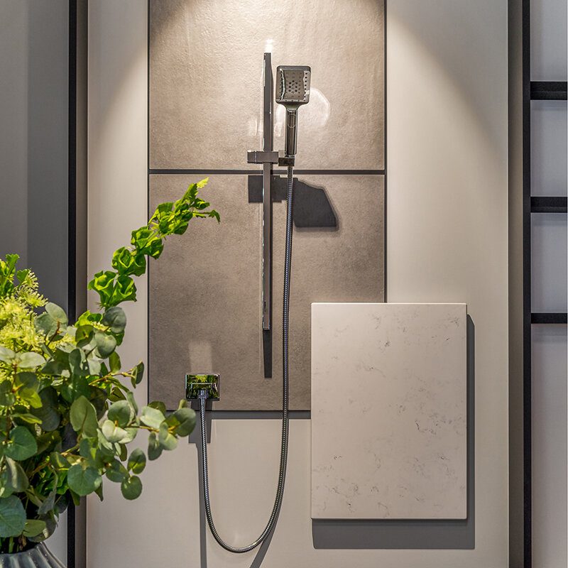
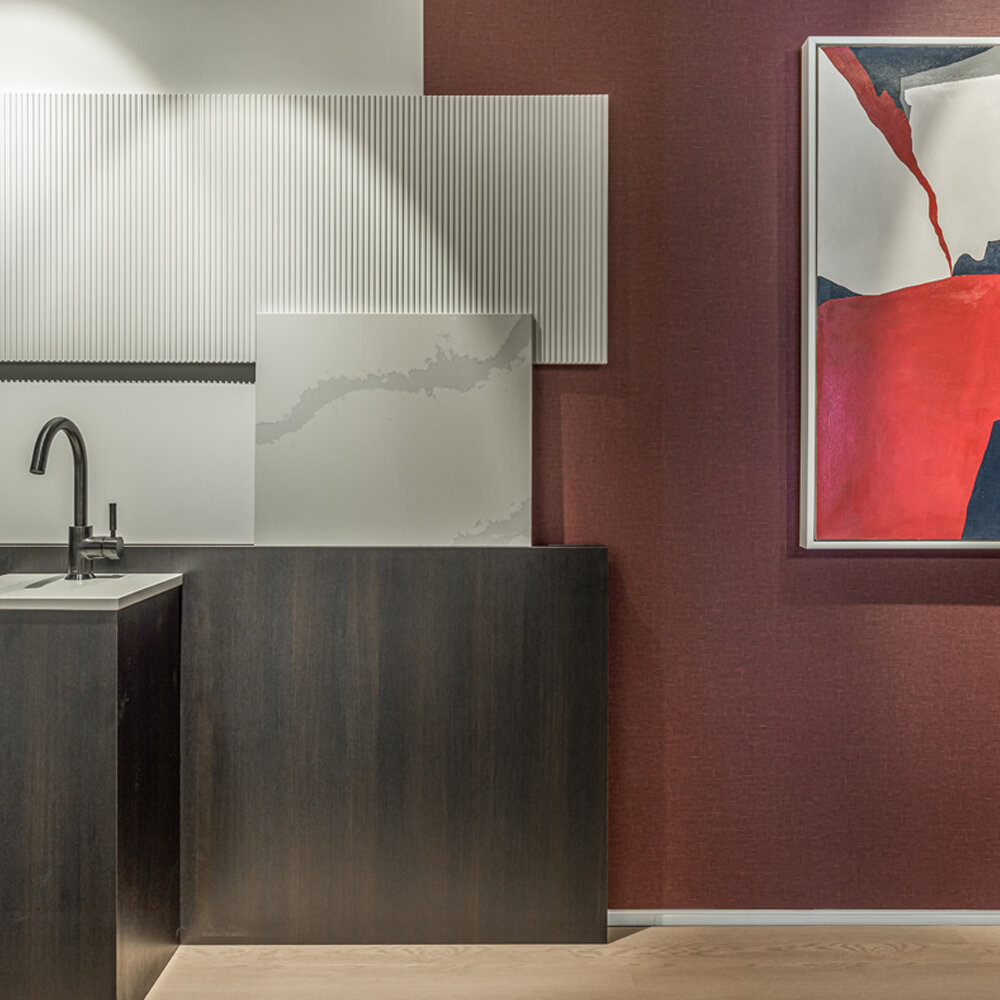
Interiors-led installations, which includes the layered display of tactile materials have been set up in each ‘living room’. These have not only been designed for efficiency of space, but the capsule concept ultimately puts the quality of material finishes at the very forefront of the conversation.
Each collection becomes a unique talking point, which forms part of the wider narrative. Suna has been involved in the full design process from initial concept through to project completion, supplying FF&E throughout as well as designing and coordinating lighting and bespoke joinery.
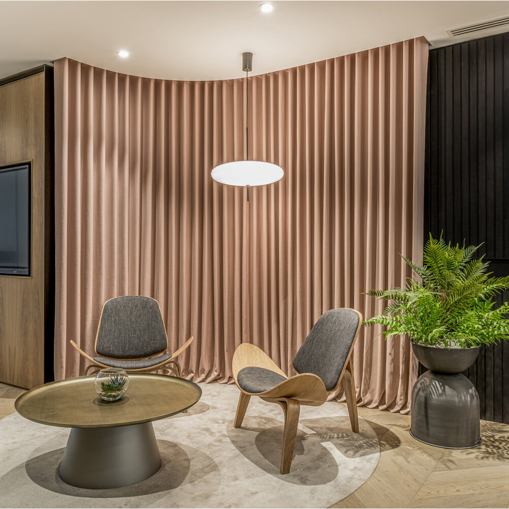
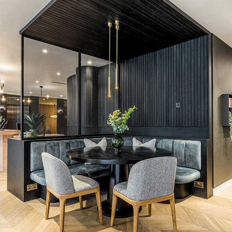
The base palette is calm and sophisticated, where sleek metallics sit alongside warm timbers. This was conceived as the backdrop onto which the more colourful branding, unique to each development, has been interpreted in playful ways to complement the spec.
Soft textures are brought through in the combination of artwork and upholstery, resulting in a truly residential offering.
MOUNT ANVIL : HEAD OFFICE
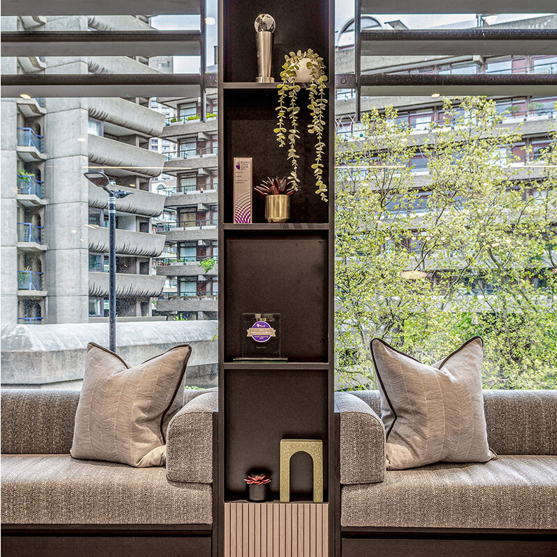
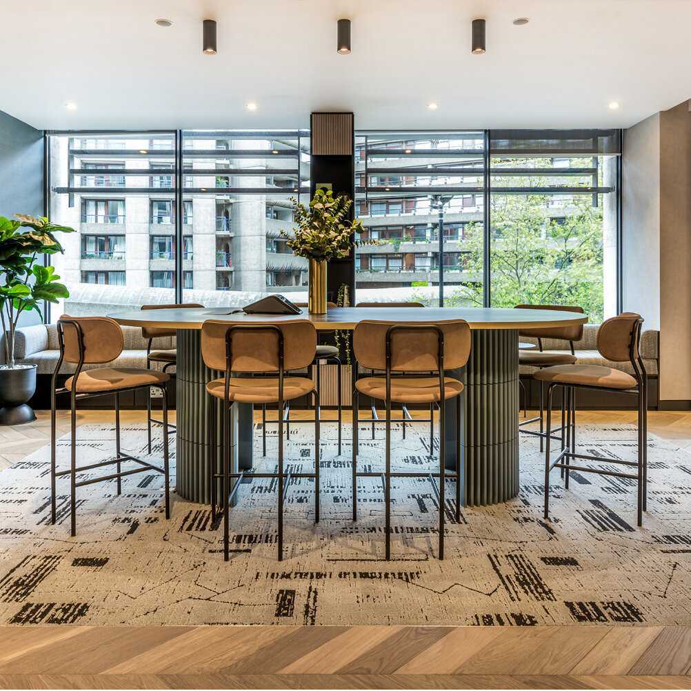
Alongside the design for Mount Anvil’s ‘Living Rooms’, the one-stop showcase for their London developments, Suna were also appointed to continue this design aesthetic throughout the main office spaces. With the sales suites now so integral to the office environment, the challenge was to create a workplace design which provided functional spaces for all. Our brief included a range of operational uses from welcome areas to host agents and purchasers, to semi-private zones for team meetings and collaboration, as well as larger spaces for events and training. As with the marketing suites pods, Suna took on the full space planning as well as the design and specification of all FF&E. The decision to open up the reception area and introduce glazed partitioning has allowed natural light to flood in from both sides of the office. In doing so, it has also given visitors and employees an impressive view of the Barbican Centre, an inspiring architectural backdrop for a design-led company.
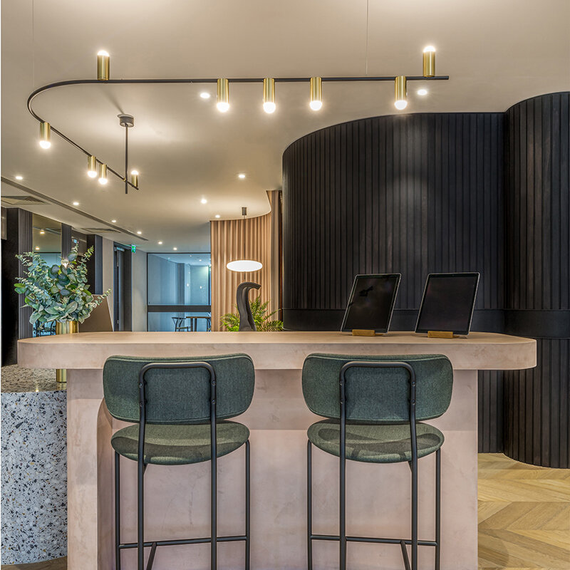
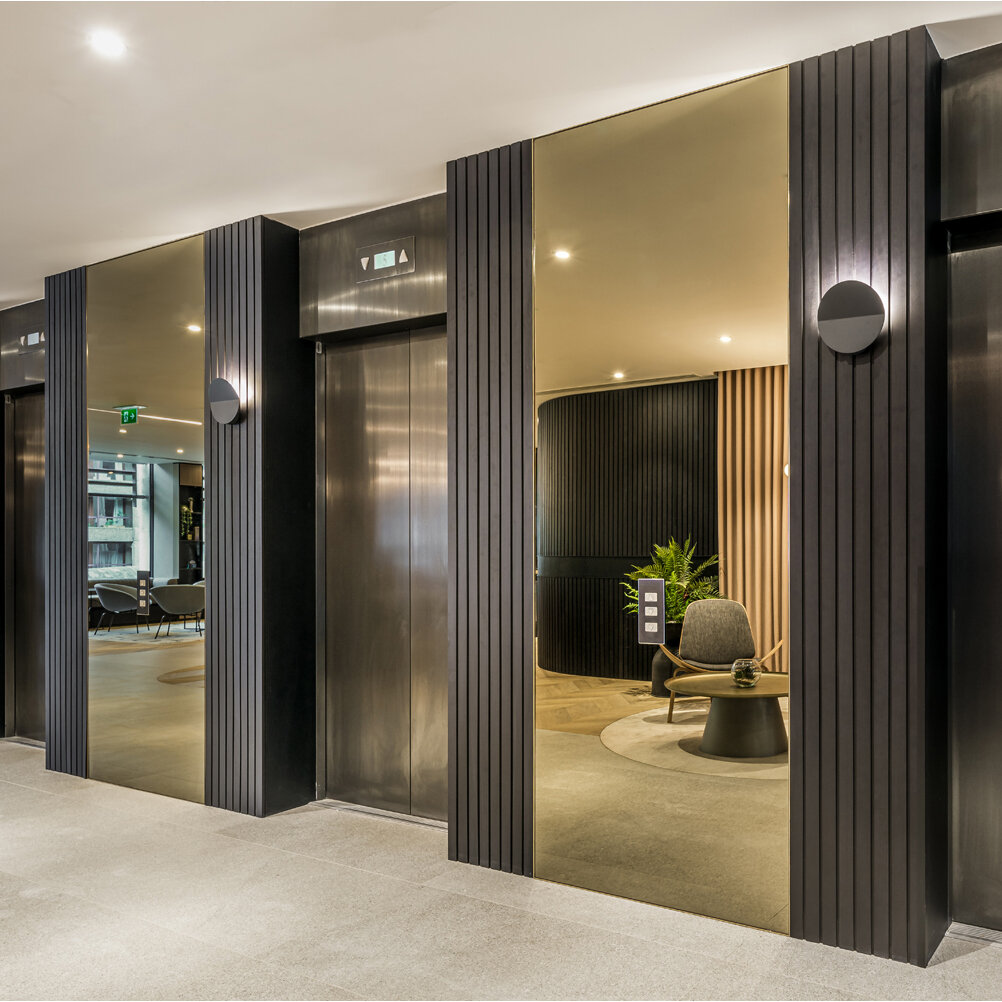
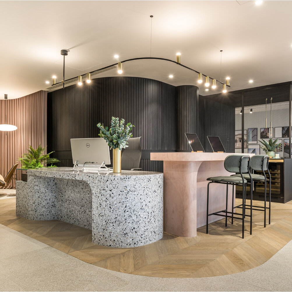
The continued use of curves, in both the interior architecture as well as our bespoke designed pieces, removed harsh lines and angles and enabled us to achieve that subtle flow through the different areas. The use of ribbed panelling, which curves its way along the front elevation all the way around to the entrance to ‘Living Rooms’, starts off the customer journey. You then continue to be met with interesting, sculptural design features along the way.
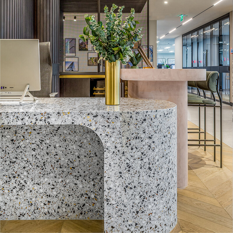
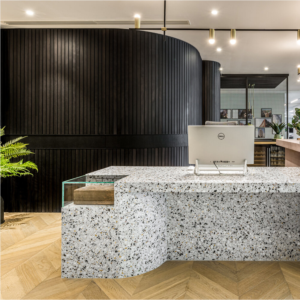
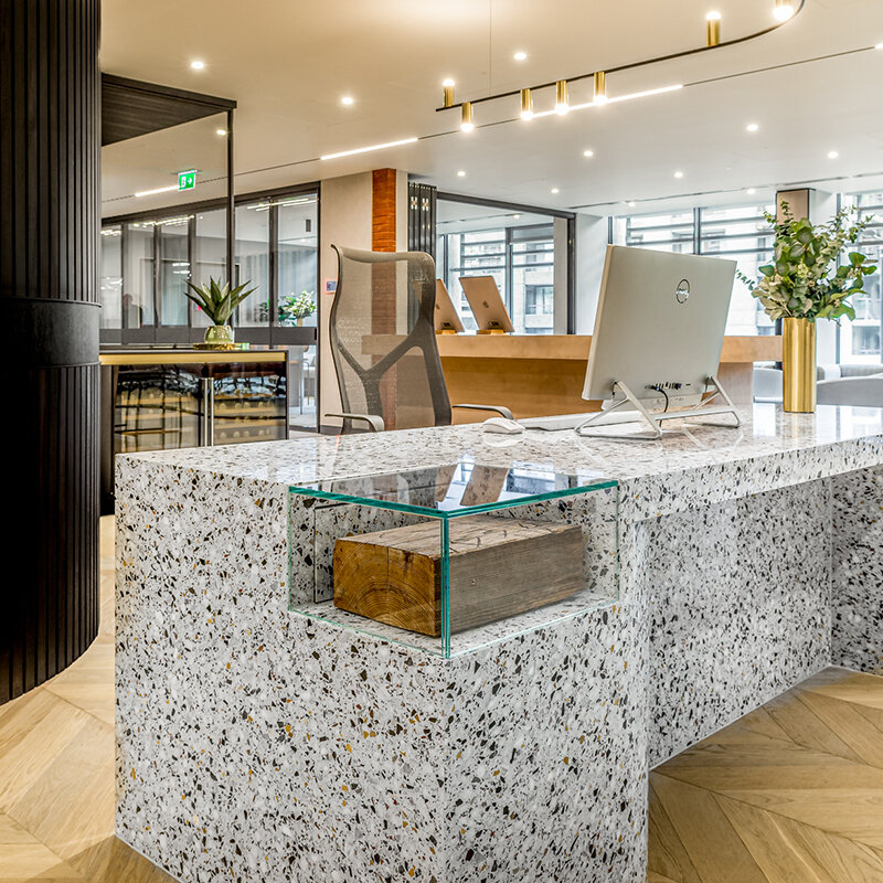
The reception desk, with its dual function as a welcome touch point and a place to greet agents or buyers with a refreshment, is a truly statement piece as you enter from the lifts. It combines tactile materials including terrazzo and polished concrete.
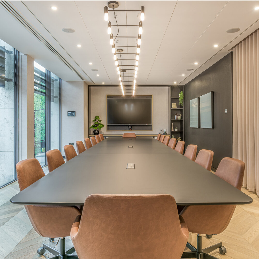
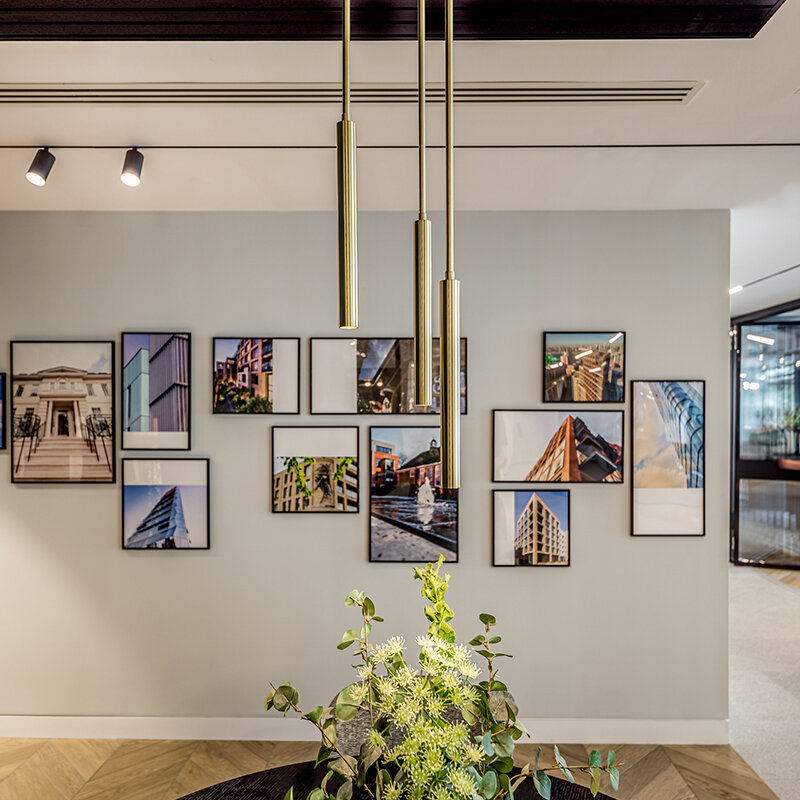
The residential aesthetic was as important here as it was throughout the sales suites and so curved curtaining and bespoke brass feature lighting has been introduced in both the entrance lobby and meeting room spaces, to soften the materiality of the overall design.
The boardroom, referred to internally as ‘Lexicon’ in reference to Mount Anvil’s east London development, has been positioned at the front of the office and the fully glazed curved wall once again enhances that sentiment of openness and transparency. Alongside the boardroom, a soft seating area and adjoining hosting space are separated by bifold doors, allowing the client to enjoy flexibility throughout the working day, and gives them the ability to completely open up the space for large scale events.
The use of digital technology was key throughout the design of these areas in order to create that personalised customer journey that visitors will remember. It has also been used to encourage agile working for the Mount Anvil team, where employees or agents can easily set up and work from a comfortable location anywhere in the office – something workplace design is increasingly requiring.
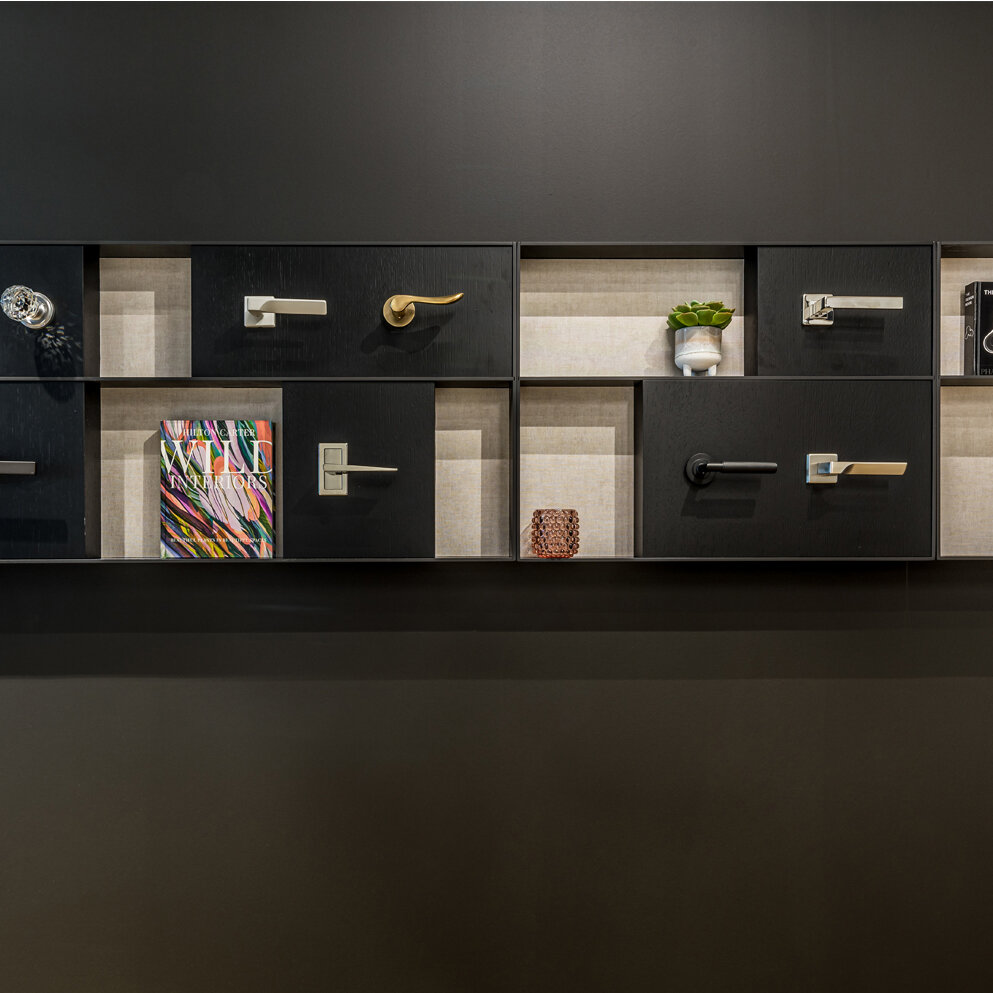
A unique part of the narrative for Suna was the inclusion of ‘quality stories’. This client has some really interesting historical, architectural and eco stories to tell and a number of pause points have been woven into the design, to encourage visitors to join the conversation. A red brick column on the corner of the hosting space, introduces their Keybridge site in Vauxhall which stands as Britain’s tallest residential brick tower. An original piece of roof timber from The Holy Trinity Church which was refurbished by Mount Anvil in 1998, is now housed within a glass case sunk into the reception desk. However, it must be said, a favourite element for us to design was the handle installation which takes the form of ironmongery from across numerous past projects and, in many ways, showcases the passion for quality which lies at the heart of this scheme.
To subscribe to our Journal and receive notification of new posts please go to SUBSCRIBE and select JOURNAL, thank you!


