Behind the Design at Wing, Camberwell
Behind the Design…at Wing, Camberwell
8.11.18
A show home of this unique nature starts it’s life with a site visit. And with an eye for being able to visualise what the space might feel like when it is actually built. When there are no doors or plaster board, no flooring or paint, no kitchen or bathrooms. It’s an opportunity to get a feel for the space, for the volume, for the quirks of the apartment. To assess the light and the views, to look at the potential and the possibilities.
At this warehouse refurb for Hyde New Homes at Wing in Camberwell, the first impressions were of dappled light coming in at the rear of the property, of the huge scale Critall-style windows, of the ceiling heights and the generous proportions of the rooms. And of that living area, one whole wall of full 3.5m high warehouse windows, floor to ceiling and amazing.
The design process then hits full speed, assessing the client’s brief and the target market, the location and the competition, the selling values and the property specifics, all to pin down an approach for the look at the feel of the design scheme. At Wing we were looking at prospective purchasers choosing to live in a vibrant, edgy and multicultural part of London. Selling prices indicated that the target market was pretty affluent and had a decent amount of disposable income. The nature of the property led us to target buyers who want the convenience and ease of a new build home but aspire to unique and individual properties with character and bags of unusual features. Camberwell is a bit of a hot bed of new properties at the moment so it was important to stand out from the crowd and design something that would be impactful and memorable. So that’s what we did.
Adding in nods to the warehouse refurb with a concrete-effect ceiling paper throughout the whole of the living area and a painted brick wallpaper in the second bedroom, we brought additional life and soul into the space. We chose a media-savvy couple as our prospective purchasers and gave them a home that was brimming with personality and unique finds, one-off artwork and books, music and vibrancy.
In the main living area we added in bespoke high level shelving, taking advantage of those ceiling heights, and we filled these shelves with hundreds of books. Photography and graphic artwork all played a huge part in establishing the personality of the purchasers, with a wrap-around gallery in the living area, and a long hallway lined with large scale prints. Tones of walnut, leather and wood bring a warmth to the living area, combined with the more industrial influenced metal black furniture, all enlivened with the punchy deep orange of the feature armchairs, topped off with the very lovely Fornasetti cushions.
A dining table set within the kitchen, in front of the oversized doors to the terrace, brings solid wood and leather together against the white of the kitchen and the black metal doors. A bespoke steam punk pendant hangs over the table, squirrel bulbs adding just the right touch of light to the vignette. Industrial metal cabinets, mirroring the doors and windows add personality and individuality to the kitchen and the carnival YEAH YEAH letters strike a focal point and bring the eye right back to the fantastic ceiling heights.
Into the master bedroom, complete with a four poster bed facing the enormous expanse of windows, through which the most amazing light falls into the room. Softened with velvets and cotton, and teamed with skinny framed brass furniture this room holds it own with the architecture of the apartment whilst allowing that little bit of lux and bedroom decadence to creep in. Rarely does a four poster bed work as well as it does in this room. Normally a four poster risks negatively influencing the proportion and feeling of space, but in this bedroom it merely accentuates the volume and proportions, reinforcing the feel of light and air and height.
A second bedroom fit for any guests or visitors, in shades of white and taupe and grey, set against a backdrop of a gallery on a worn brick wallpaper wall. The personality of the occupiers again in abundance with the choice of photographic images, vintage screen and choice accessories. The height of the room referenced with the high level shelving bringing a bit of greenery and rattan into the space, warming and enlivening this lovely bedroom.
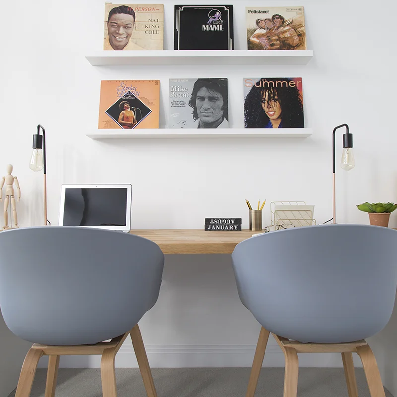
And finally, the kind of study we might all aspire to. An expansive desk, topped with a solid oak slab, above which sit row upon row of selected albums-as-artwork. A visual playlist of the best kind. Room for two workspaces, it’s the stuff of coupley-dreams. Though you might just end up arguing about who goes and makes the tea. Or the gin and tonic.
To subscribe to our Journal and receive notification of new posts please go to SUBSCRIBE and select JOURNAL, thank you!


