The brief for this project was to create a best-in-class sales and marketing suite at Related Argent’s Heart of Hale development, located in the creative neighbourhood of Tottenham Hale in North London.
The space itself is in a prominent position, with two fully glazed elevations, exposed to the busy footfall around the recently refurbished Tottenham Hale station. The floor to ceiling height is up at almost 4 metres so we were able to really push our creativity in designing something that had huge impact both internally and externally.
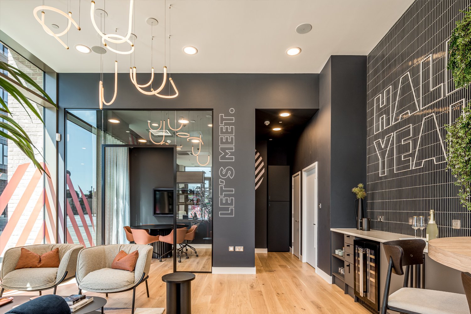
Being a vibrant and creative area, the development’s branding gave huge inspiration to the look and feel of our final design. Playing with the circular formations and linearity from the stripes in the branding, we wanted to create a design that felt fun and energetic, yet still sophisticated and in line with the developers’ own identity. The colour palette within the branding also influenced our design. With a base palette of the deep navy and charcoal, we then injected those fab pops of brick reds and dusty pinks throughout the scheme. We also introduced a copper metallic finish in lighting and bespoke joinery, which complimented our colour palette and achieved an elevated aesthetic.
A key piece in this design is the sales desk. We were keen to create something that felt completely different to your standard reception desk and integrate these fantastic curves and linear forms from the branding. Finished in a copper metallic with contrasting blush pink cladding, the desk’s curving facade ends in a gorgeous black circular end table, with curved slab leg - a real statement piece as you first enter.
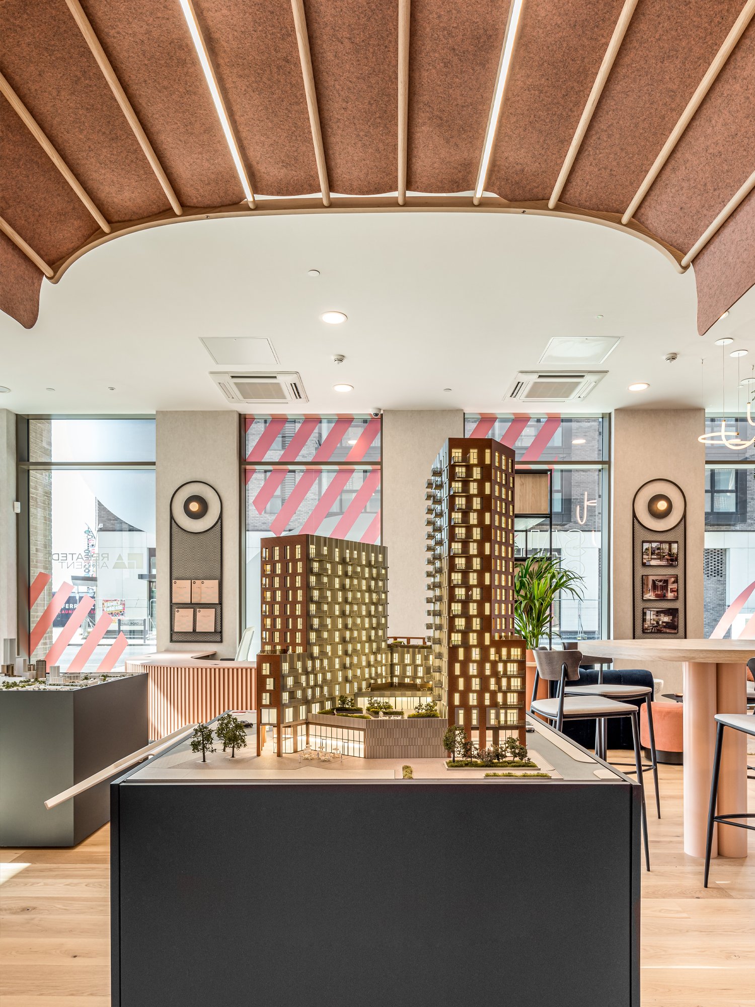
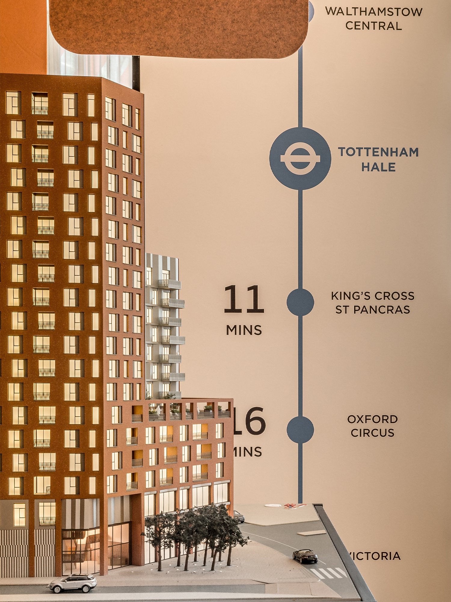
Another key feature in the space is the canopy that hangs over the model. An important space from which to sell the scheme and different phases from, we wanted to ensure the model area was a key focal point of the design. Again, utilizing the 4m ceiling heights, we suspended a lit fabric canopy over the model, not only to highlight the area, but also to create a sense of intimacy in a unique way. The canopy added depth to the space with a further layer of materiality, with its curved wood frame and a-symmetrical textile covering.
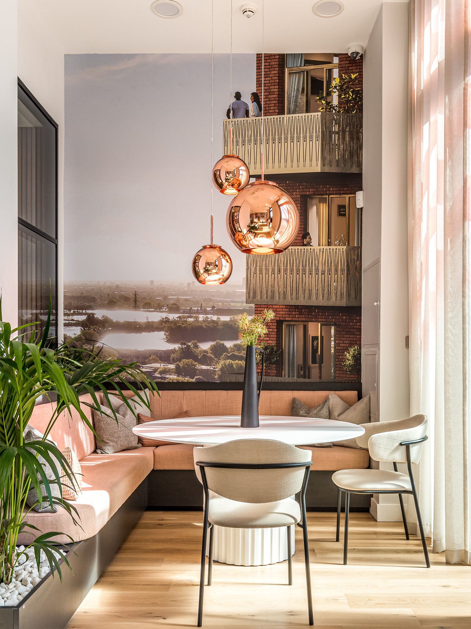
In terms of the functionality of this Marketing Suite, the client wanted to step away from a corporate feeling space, and create something that had more of a club-lounge feel, reflecting the “Island Club,” that will form the amenities spaces in the upcoming Ferry Island phase. We designed a loungey soft-seating area for informal chats, an intimate banquette corner offering comfortable seating for more private conversations, and a circular high-bar table connected to the refreshments area. This particular piece was designed to function as a kitchen island would - a central place for potential purchasers to gather around, as well as a great space when hosting social events and launch parties.
Written by Interior Designer for the project, Ella Bartron
Photography by Franklin & Franklin.


